Layout
All layouts are based on a pre-determined grid. This system allows for very free design, which can react flexibly to differing formats and requirements. Visual brackets are set by vertical and horizontal stripes that derive from the logo and build on it.
Please note that advertising materials should ideally be created by professional designers. For example, the colleagues at the University Printing Service can help you with this.
In addition, there are some helpful PPT templates in the template section.
Layout Grid and Stripe Objects (InDesign)
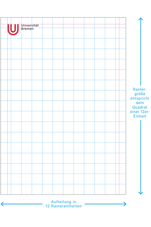
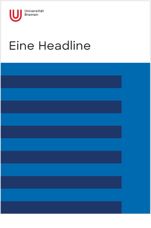
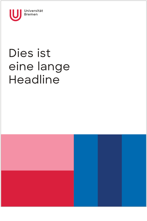
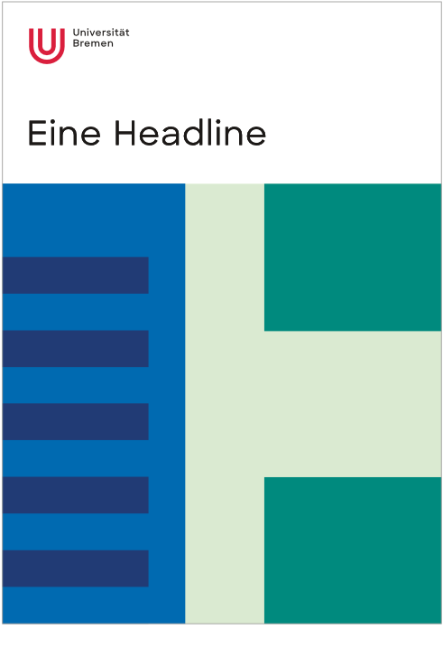
The grid for homepages is made up of square-like spaces. The short format page is split into 12 grid units. Based on this grid size, the relevant number of units can be duplicated to fill the format height. Small deviations can be eradicated by spacing the lines equally to cover the format (InDesign setting: align objects / space out around horizontal middle axis).
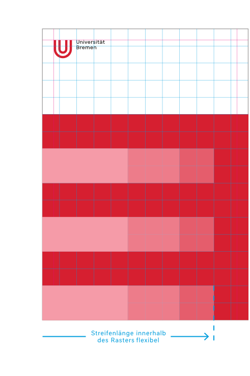
A colored space with stripes is set on the grid (stripe object). A maximum of two colors from one color group are combined. The stripe width and length is aligned with the grid. All stripes within one color space have the same width and length. The distance between each of the stripes is identical and corresponds with the stripe width.
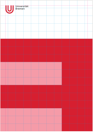
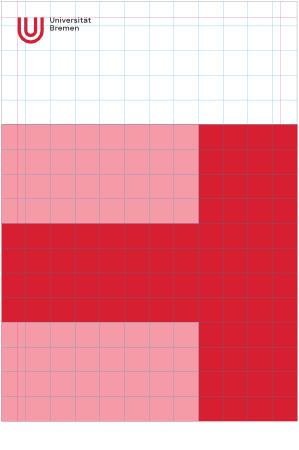


Two stripe objects that are different in color can be combined. The colors within one stripe object must come from the same color group (see the section “Colors”). As a maximum of two stripe objects per layout can be combined, a maximum of two color groups can be used. Which color groups can be combined is stated in the “Colors” section.


Prohibited Layouts
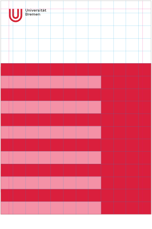
A great deal of layout variations are possible within these guidelines. Layouts where individual forms, such as letters, negative effects, or visual associations are created are prohibited. Stripes that are too short and are likes boxes should be avoided. Placing text on color surfaces should also be avoided.

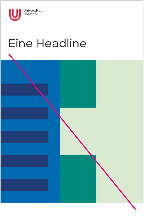

The stripes should run from the outside in and not from the inside out. Generally, there should be a harmonious surface distribution, where the basic concept of stripes on a color surface should be recognizable.
Please contact your colleagues in the marketing team or at the University Printing Service if you are unsure.
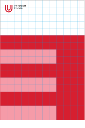
The negative examples shown above would be allowed again as follows:

Accessibility
Please also note the information on the topic of “Accessibility and Corporate Design” on the relevant page in the menu. Alongside tips on accessible designing of communication media, you can also find the basics concerning the logo, typeface, layout, and colors as an accessible text file that can be downloaded there.
more